Build a basic search interface in UI Studio Builder with Search Bar, Results, and Facets components.
This guide walks you through building a basic but functional search interface in UI Studio Builder. By the end, you will have a composition with a Search Bar, Results, Facets, Text, Image, and Button component working together as a complete search experience.
Navigate to UI Studio in the left navigation panel and click Builder.
The Compositions screen, where you create, manage, and publish your UI Studio compositions.
On the Compositions screen, click Create New UI.
Enter a name and description for the composition and click Create.
Add a new composition.
The new composition is listed on the Compositions screen. You can now select the composition and build it.
2
Open your composition
On the Compositions screen, click a composition to open it in the editor.
Composition Editor screen
3
Set canvas properties
Click the main canvas and then click the gear icon to open the Customize panel on the right. Set a background color to match your company’s branding, or adjust the section dimensions. These settings can be refined at any time.
Customize canvas properties
4
Add components
In the left panel of the Editor screen, click Components. Available components are listed in the left sidebar, organized into two categories: Search and Content.
Composition components
To customize each component, click the component in the Editor screen and select values in the Customize panel on the right. Set a background color to match your company’s branding, or adjust the section dimensions. These settings can be refined at any time.
5
Add a Search Bar
Search Bar
Accept user queries and trigger search across your datastore.
In the left sidebar, find the Search Bar under the Search category. Drag it from the sidebar and hover over the header section in the canvas. The interface indicates where the component will land as you hover. Drop it into position.
Search Bar component dropped into the header section
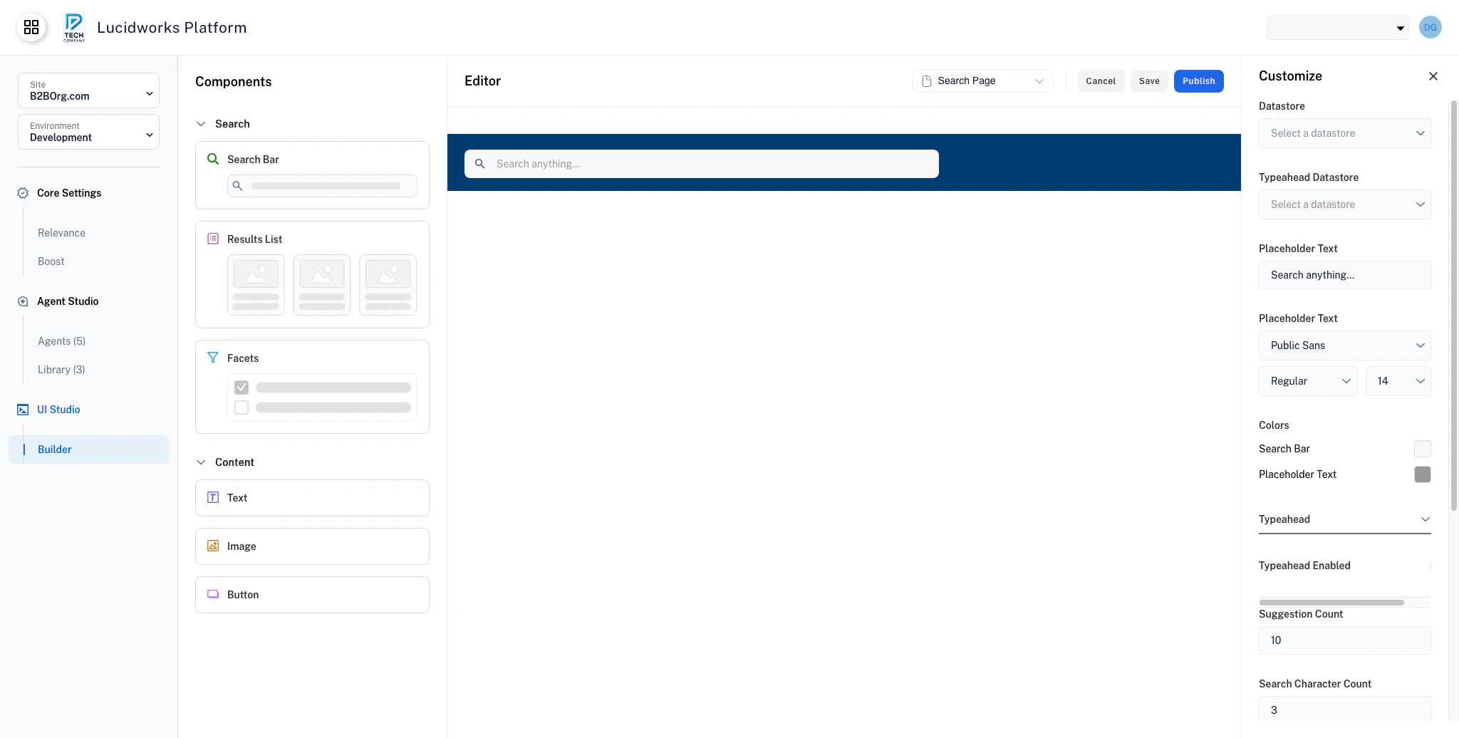
The Customize panel opens on the right with the Search Bar configuration options. Configure the following:
Datastore: Select the datastore you want to use for search queries.
Typeahead Datastore: Select the datastore for autocomplete suggestions. This can be the same datastore as the one above.
Placeholder Text: Replace the default text with something descriptive for your users, such as Search our site.
Typeahead: Expand this section and toggle Typeahead Enabled to turn autocomplete on or off.
UI Studio: Data Integration & Customization
Learn how to link UI Studio components to Fusion datastores for live data, then use preview mode to validate the experience.
For details on all Search Bar settings, see the Search Bar component documentation.
6
Add a Results component
Results
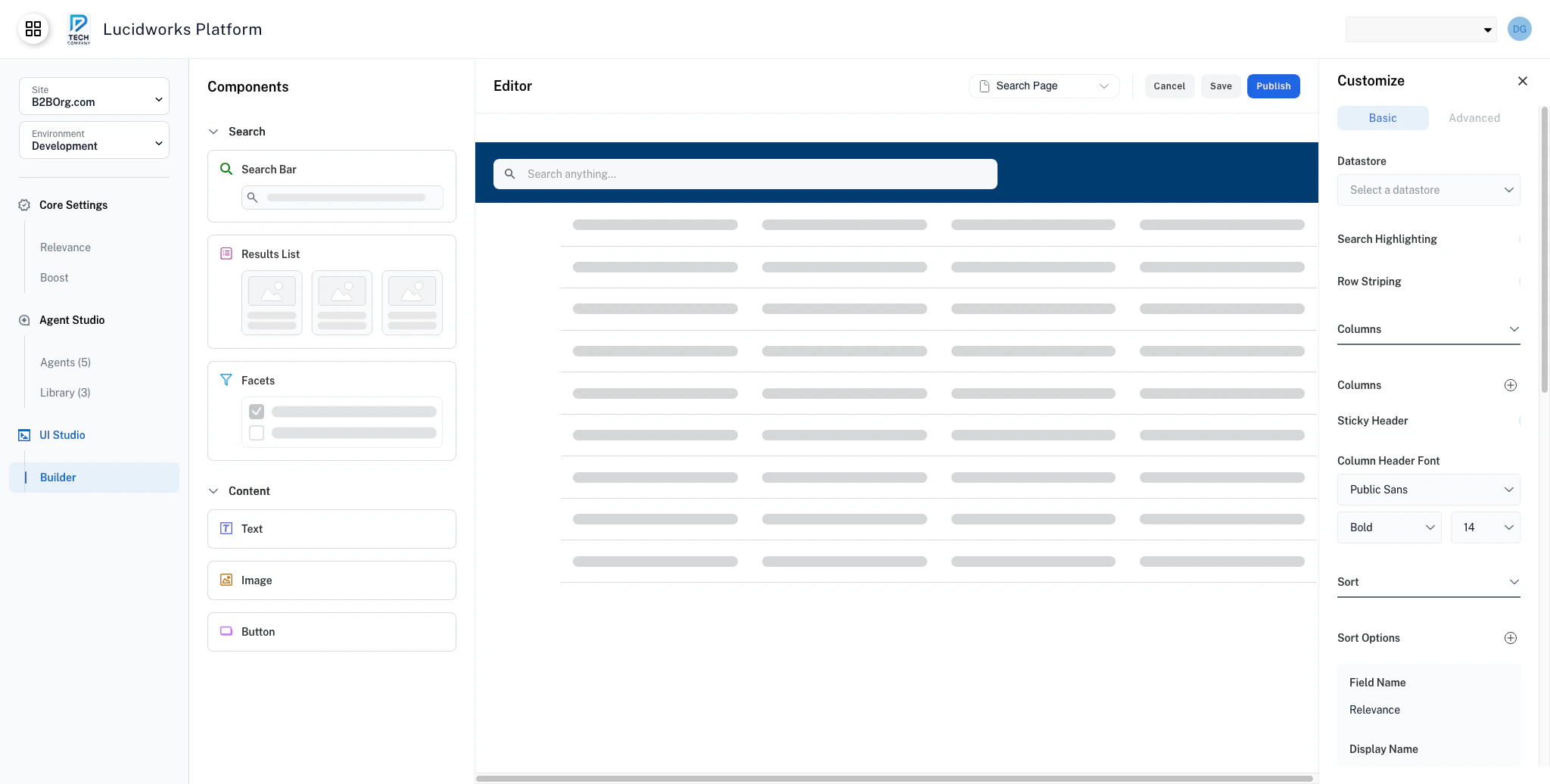
Display search results in a table view with sorting and pagination.
Drag the Results component from the Search category in the left sidebar and drop it into the body area of the canvas.
Results component in the canvas
In the Customize panel, set the Datastore to the same datastore you selected for the Search Bar. This ensures the Results component displays results from the same search. Adjust the Pagination setting from the default to control how many results appear per page.
Advanced compositions may use multiple Search Bars and Results components to support separate search experiences on the same page. For example, a company intranet might have one for document search and another for people search. To accommodate this, add a new section to the canvas by hovering between existing sections, where the option to create a new section appears.
For details on all Results settings, see the Results component documentation.
7
Add a Facets component
Facets
Let users narrow results by filtering on field values.
Drag the Facets component from the Search category and drop it onto the canvas alongside the Results.
Facets component in the canvas
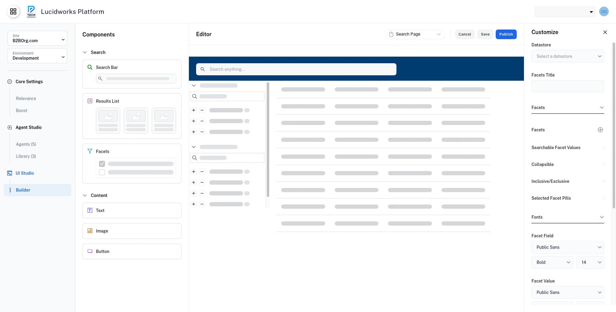
In the Customize panel, set the Datastore to the same datastore as the Search Bar and Results. This ensures the facets filter the same set of results. Configure a few options to shape the filtering experience:
Searchable Facet Value: Toggle this on to add a search box within each facet category. This is helpful when a category has many values.
Collapsible: Toggle this on to let users collapse and expand individual facet categories to save space.
Selected Facet Pills: Toggle this on to show active filters as removable pills at the top of the facets panel.
For details on all Facets settings, see the Facets component documentation.
8
Add content components
Text
Add text content with rich styling options.
Image
Display images with optional links, borders, and fallback support.
Button
Add navigation, export, or action buttons to your pages.
With the core search components in place, add content components from the Content category in the left sidebar: Text, Image, and Button.
Text: Drag a Text component onto the canvas. For example, place it above the Results component as a section heading. The canvas layout adapts flexibly as you place components.
Image: Drag an Image component next to the Search Bar in the header section. In the Customize panel, upload your company logo and set an appropriate width and height.
Button: Drag a Button component onto the canvas. In the Customize panel, set the Type to Link, enter a label such as Visit our site, and enter your company site URL in the Page Path field.
Explore the configuration options for each component. For details, see the Text, Image, and Button component documentation.
9
Save or publish your composition
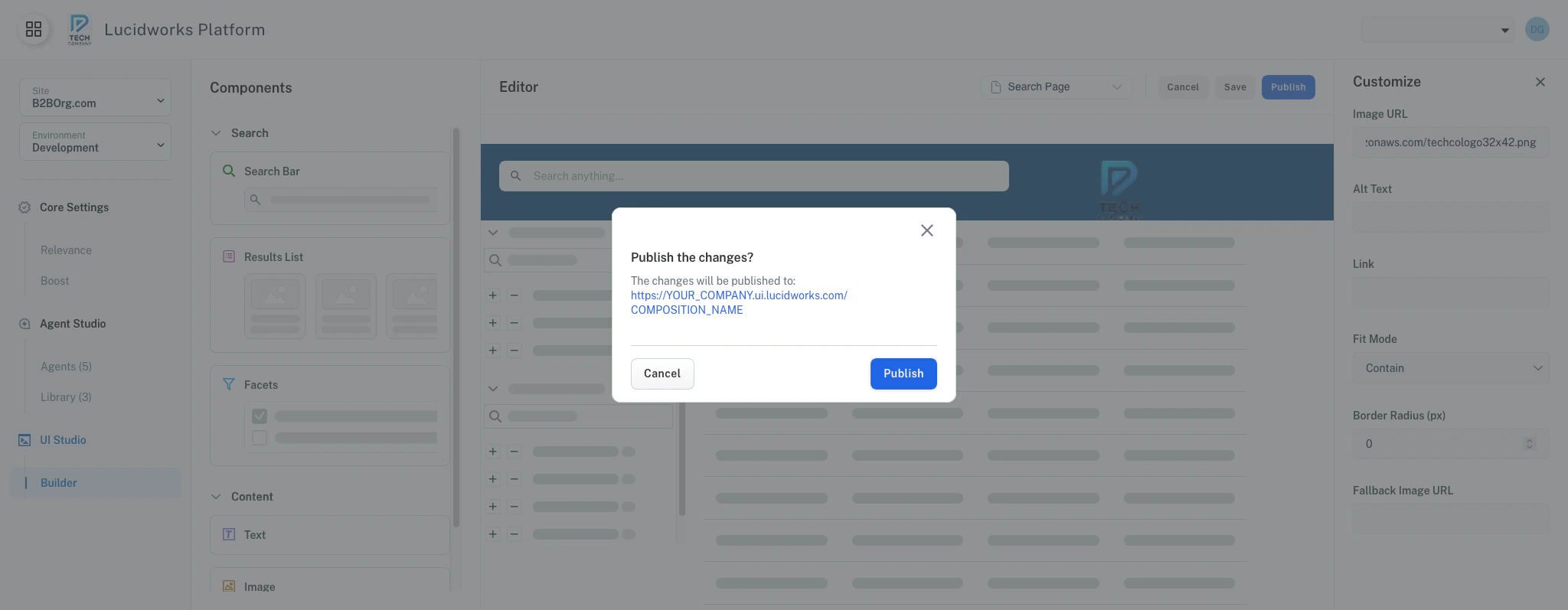
When you are satisfied with your composition, use the toolbar at the top of the builder to save or publish it.
Publish confirmation screen
After publishing, preview the composition to see the user experience. Test a search query, apply facet filters, and confirm that the results update as expected.