

Grid System
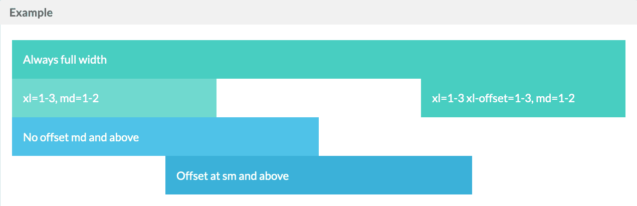
Twigkit uses a response 24 column grid system. The column widths are specified using a ratio of 24ths.
For example at the attribute
sm="1-3" to the layout:block tag to set the width to 1/3 of the container width on small screens.
By default layout:blocks will be 100% width.
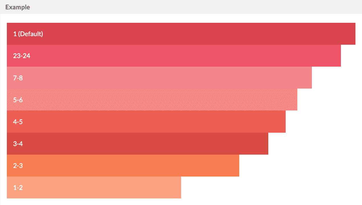
Grid Breakpoints
Widths can be specified for each of thexs, sm, md, lg, and xl breakpoints individually.
lg
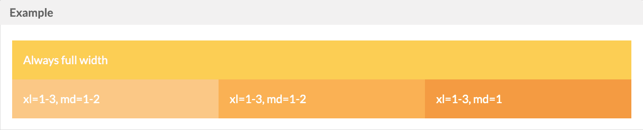
md
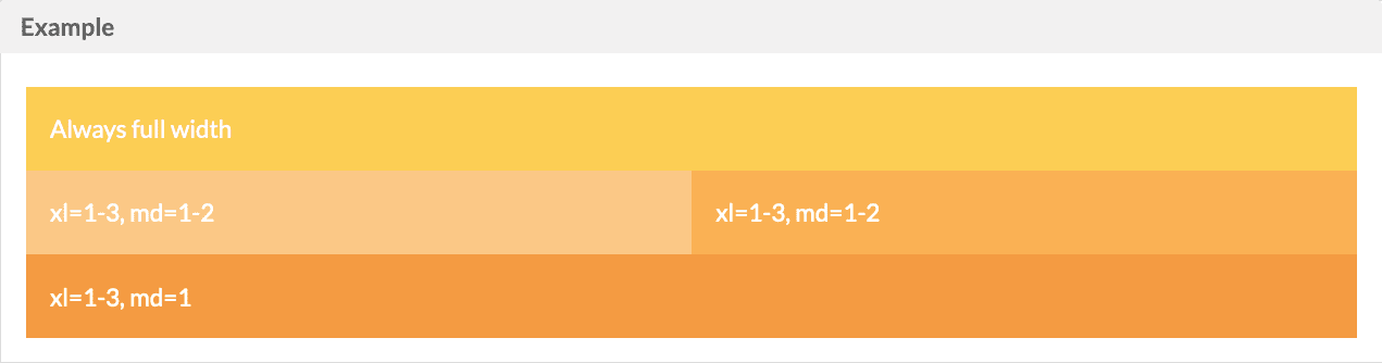
sm
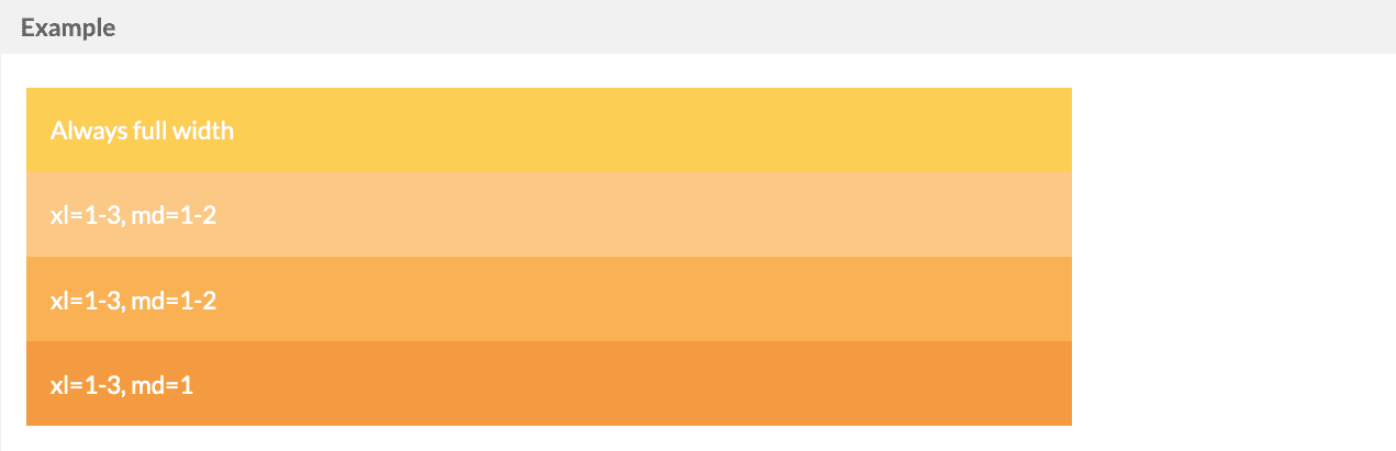
Grid Offsets
An offset attribute can be used to push thelayout:block to the right, leaving an empty space
Nested
Standard Button
Image
Standard Button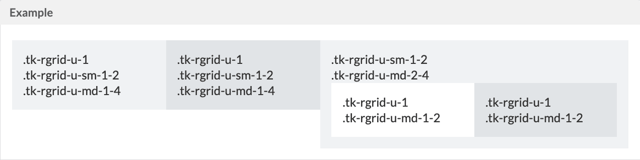
Justify Content

Hide
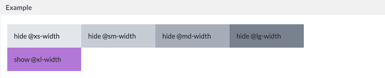
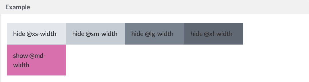
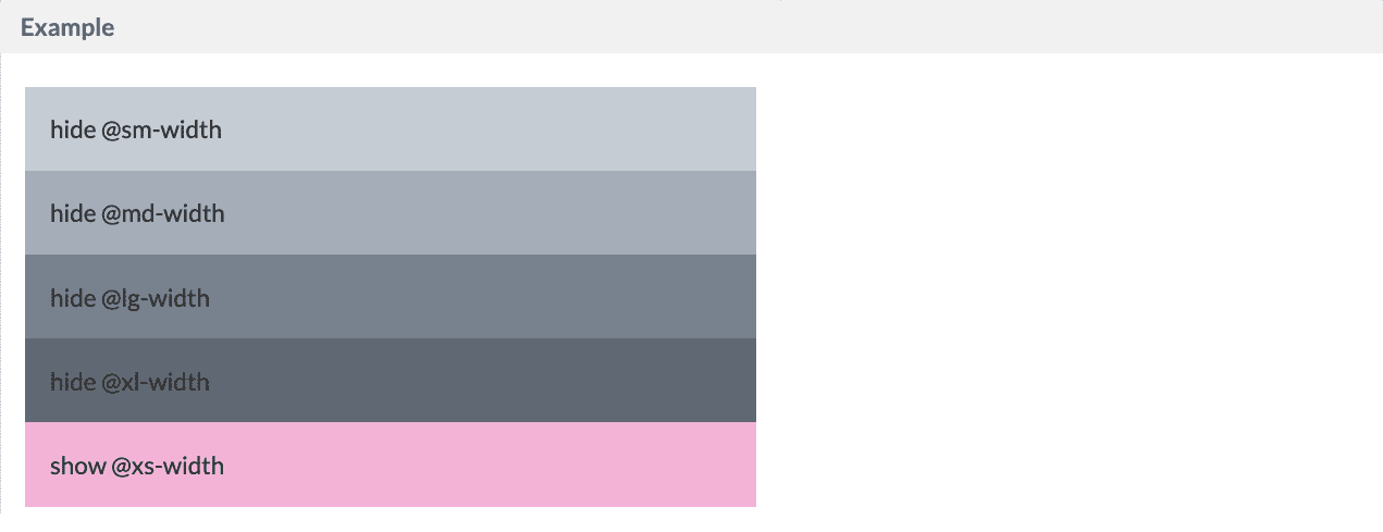
You can hide the layout by using hide or show at your desire size pointstyling="hide-xs"
xl
md
xs
Alignments
Default (Stretch)
.tk-rgrid-align-top)

.tk-rgrid-align-bottom)

.tk-rgrid-align-middle)

.tk-rgrid-align-stretch)


Justify Items
Default, Align items to the start (.tk-rgrid-justify-start)

.tk-rgrid-justify-end)

.tk-rgrid-justify-center)

.tk-rgrid-justify-around)

.tk-rgrid-justify-between)


Container Direction
Row - Default (.tk-rgrid-direction-row)

.tk-rgrid-direction-row-reverse)

.tk-rgrid-direction-col)

.tk-rgrid-direction-col-reverse)

Offsets
