> ## Documentation Index
> Fetch the complete documentation index at: https://doc.lucidworks.com/llms.txt
> Use this file to discover all available pages before exploring further.
# Grid
export const LwTemplate = ({title = "Key questions to get you started", icon = "sparkles", cta = "Powered by Agent Studio", linkHref = "https://lucidworks.com/demo/?utm_source=docs&utm_medium=referral&utm_campaign=docs_cta_ai"}) => {
const [isLoaded, setIsLoaded] = useState(false);
useEffect(() => {
const timer = setTimeout(() => {
setIsLoaded(true);
}, 500);
return () => clearTimeout(timer);
}, []);
return
{isLoaded && `
}} />}
Powered by Lucidworks Agent Studio
;
};
[localhost link]: http://localhost:3000/docs/5/app-studio/reference/gallery/grid
[mintlify link]: https://doc.lucidworks.com/docs/5/app-studio/reference/gallery/grid
[old doc.lw link]: https://doc.lucidworks.com/app-studio/4.2/1032
## Grid System
| API | Device width when breakpoint overrides default |
| --------- | ---------------------------------------------------------------------- |
| default | Sets default layout direction unless overridden by another breakpoint. |
| @xs-width | width \< 35.5 em |
| @sm-width | 600 em ⇐ width \< 35.5 em |
| @md-width | 35.5 em ⇐ width \< 48 em |
| @lg-width | 48 em ⇐ width \< 64 em |
| @xl-width | width >= 80 em |
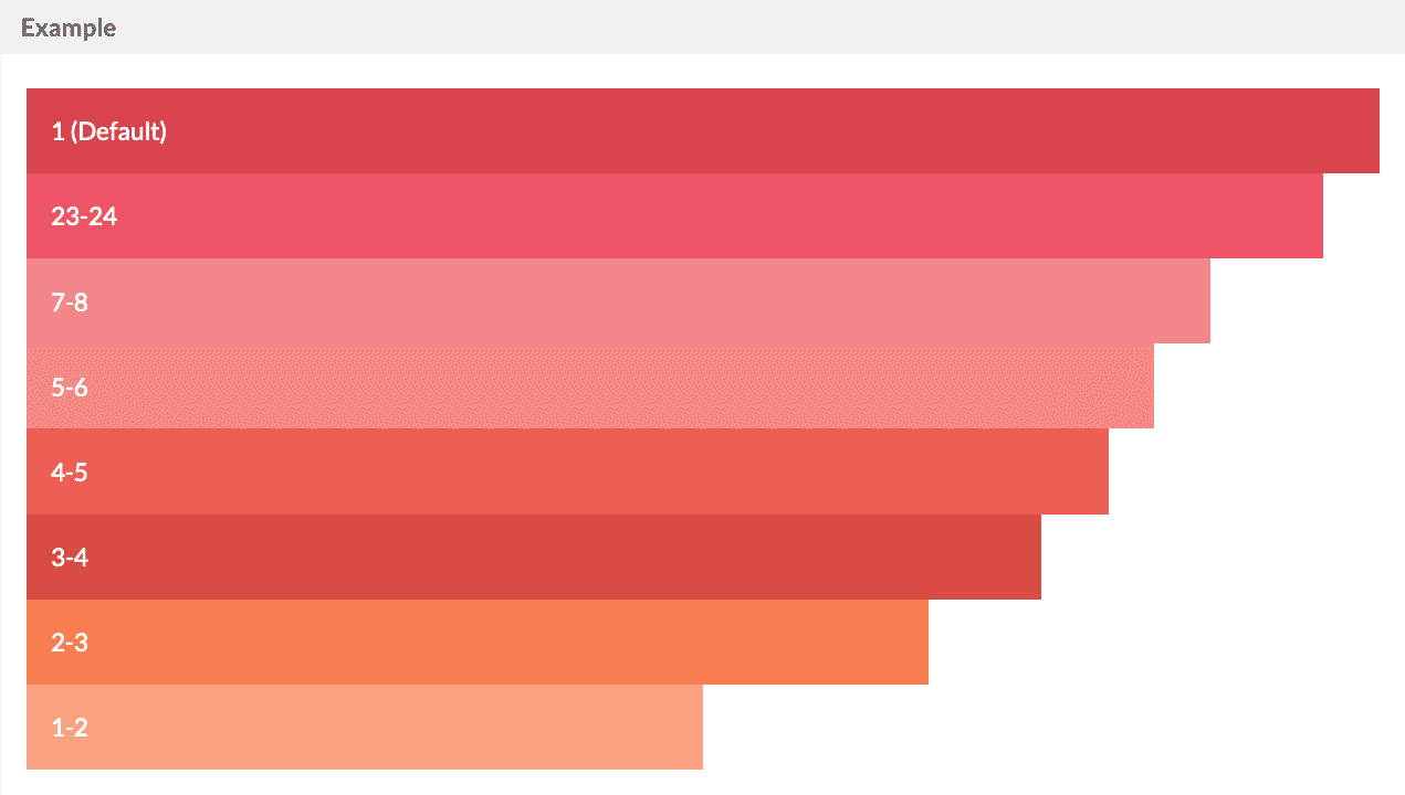
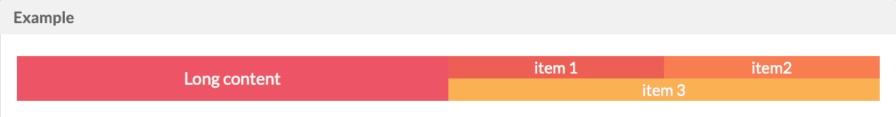
Twigkit uses a response 24 column grid system. The column widths are specified using a ratio of 24ths.
For example at the attribute `sm="1-3"` to the `layout:block` tag to set the width to 1/3 of the container width on small screens.
By default `layout:blocks` will be 100% width.
```xml wrap theme={"dark"}
1 (Default)23-247-85-64-53-42-31-2
```
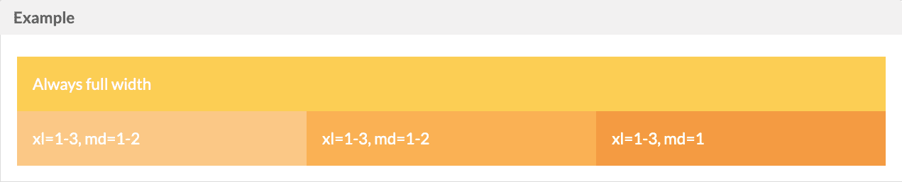
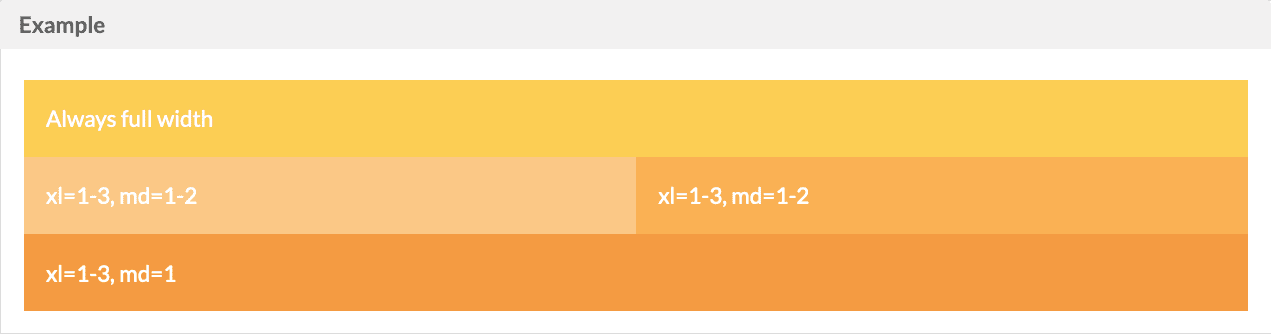
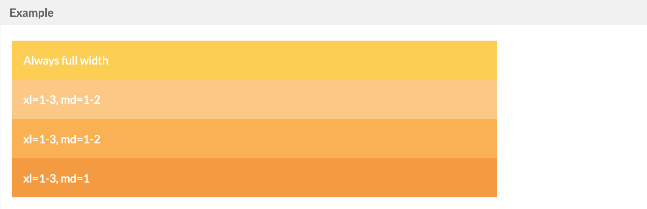
## Grid Breakpoints
Widths can be specified for each of the `xs`, `sm`, `md`, `lg`, and `xl` breakpoints individually.
`lg`
`md`
`sm`
```xml wrap theme={"dark"}
Always full widthxl=1-3, md=1-2xl=1-3, md=1-2xl=1-3, md=1
```
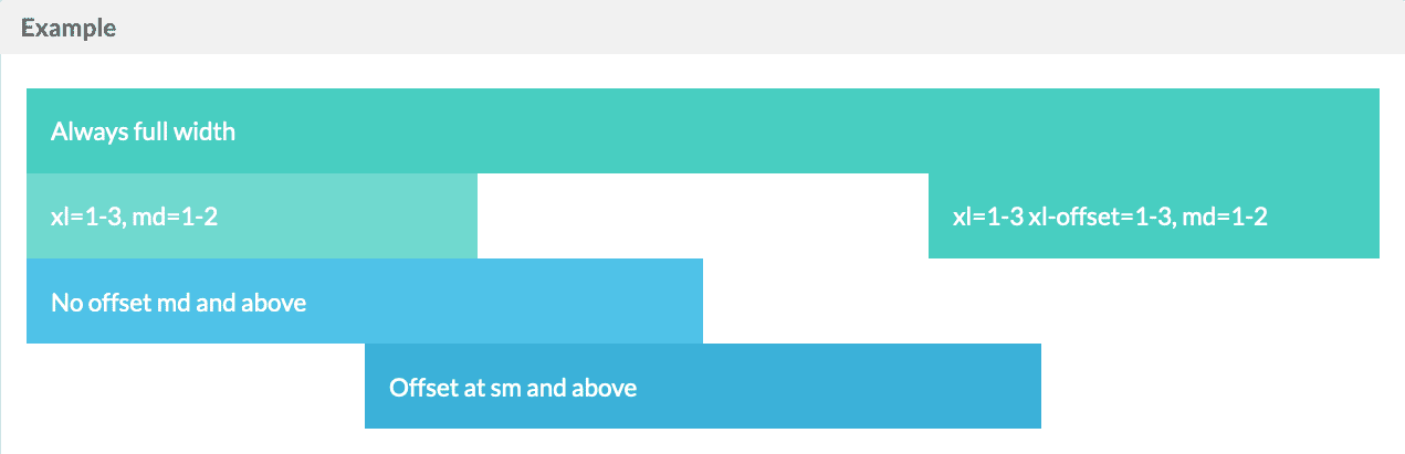
## Grid Offsets
An offset attribute can be used to push the `layout:block` to the right, leaving an empty space
```xml wrap expandable theme={"dark"}
Always full widthxl=1-3, md=1-2xl=1-3 xl-offset=1-3, md=1-2No offset md and aboveOffset at sm and above
```
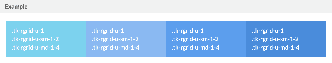
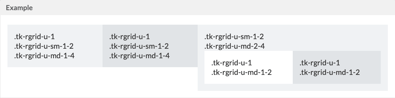
## Nested
Standard Button
```xml wrap expandable theme={"dark"}
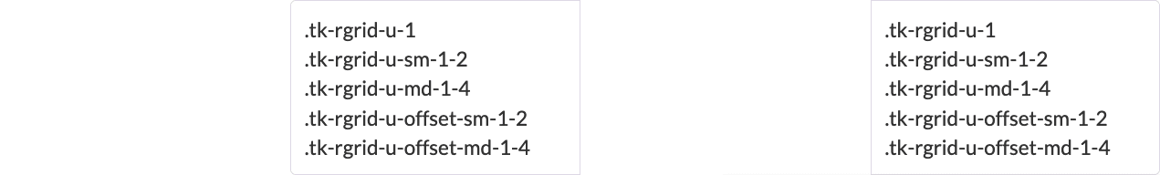
.tk-rgrid-u-1
.tk-rgrid-u-sm-1-2
.tk-rgrid-u-md-1-4
.tk-rgrid-u-1
.tk-rgrid-u-sm-1-2
.tk-rgrid-u-md-1-4
.tk-rgrid-u-1
.tk-rgrid-u-sm-1-2
.tk-rgrid-u-md-1-4
.tk-rgrid-u-1
.tk-rgrid-u-sm-1-2
.tk-rgrid-u-md-1-4
```
## Image
Standard Button
```xml wrap expandable theme={"dark"}
```
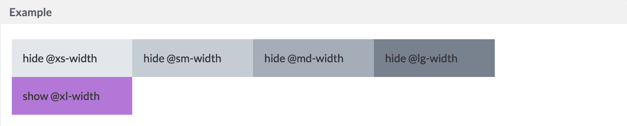
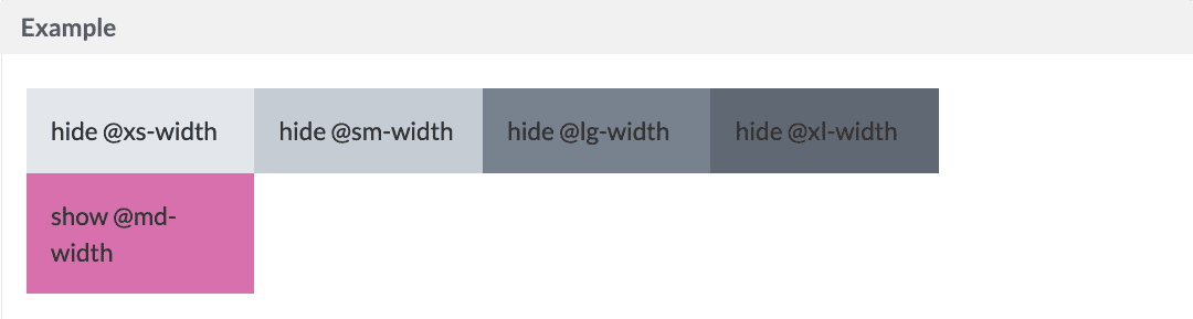
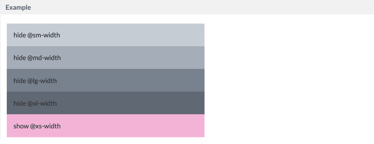
## Hide
You can hide the layout by using hide or show at your desire size point `styling="hide-xs"`
`xl`
`md`
`xs`
```xml wrap expandable theme={"dark"}
hide @xs-widthhide @sm-widthhide @md-widthhide @lg-widthhide @xl-widthshow @xs-widthshow @sm-widthshow @md-widthshow @lg-widthshow @xl-width
```
## Alignments
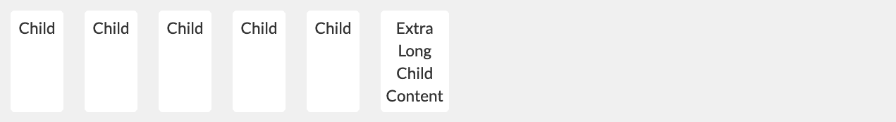
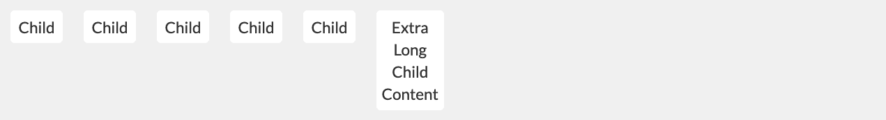
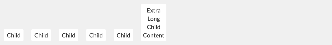
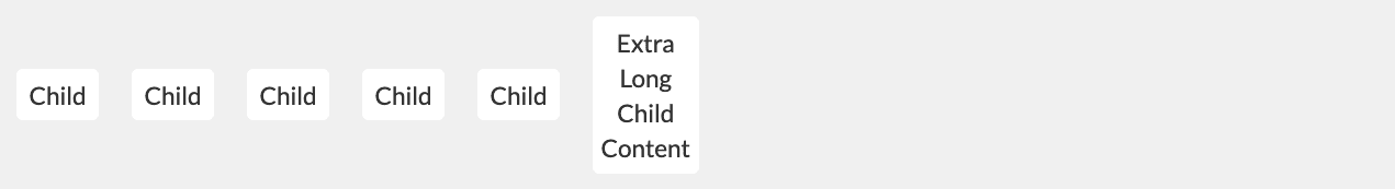
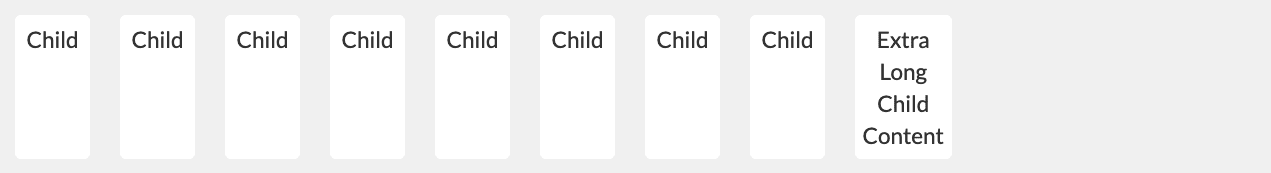
Default (Stretch)
Align All Items Top (`.tk-rgrid-align-top`)
Align All Items Bottom (`.tk-rgrid-align-bottom`)
Align All Items Middle (`.tk-rgrid-align-middle`)
Stretch All Items (`.tk-rgrid-align-stretch`)
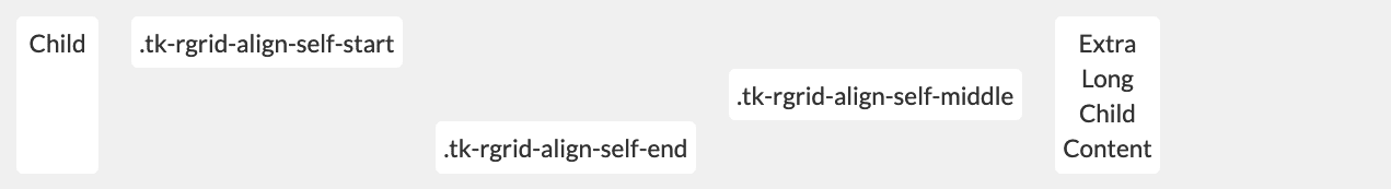
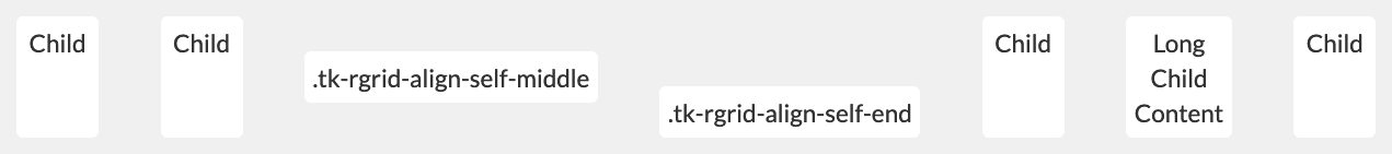
Item Alignment Overrides
## Justify Items
Default, Align items to the start (`.tk-rgrid-justify-start`)
Align items to the end of the container (`.tk-rgrid-justify-end`)
Center items (`.tk-rgrid-justify-center`)
Even spacing around items (`.tk-rgrid-justify-around`)
Even spacing between items (`.tk-rgrid-justify-between`)
Combination
## Container Direction
Row - Default (`.tk-rgrid-direction-row`)
Row Reverse (`.tk-rgrid-direction-row-reverse`)
Column (`.tk-rgrid-direction-col`)
Column Reverse (`.tk-rgrid-direction-col-reverse`)
## Offsets
 ```xml wrap theme={"dark"}
 `md`
`md`
 `sm`
`sm`
 ```xml wrap theme={"dark"}
 ```xml wrap expandable theme={"dark"}
 ```xml wrap expandable theme={"dark"}
 ```xml wrap expandable theme={"dark"}
 ```xml wrap theme={"dark"}
 `md`
`md`
 `xs`
`xs`
 ```xml wrap expandable theme={"dark"}
 Align All Items Top (`.tk-rgrid-align-top`)
 Align All Items Bottom (`.tk-rgrid-align-bottom`)
 Align All Items Middle (`.tk-rgrid-align-middle`)
 Stretch All Items (`.tk-rgrid-align-stretch`)
 Item Alignment Overrides
 ## Justify Items
Default, Align items to the start (`.tk-rgrid-justify-start`)
## Justify Items
Default, Align items to the start (`.tk-rgrid-justify-start`)
 Align items to the end of the container (`.tk-rgrid-justify-end`)
 Center items (`.tk-rgrid-justify-center`)
 Even spacing around items (`.tk-rgrid-justify-around`)
 Even spacing between items (`.tk-rgrid-justify-between`)
 Combination
 ## Container Direction
Row - Default (`.tk-rgrid-direction-row`)
## Container Direction
Row - Default (`.tk-rgrid-direction-row`)
 Row Reverse (`.tk-rgrid-direction-row-reverse`)
 Column (`.tk-rgrid-direction-col`)
 Column Reverse (`.tk-rgrid-direction-col-reverse`)
 ## Offsets